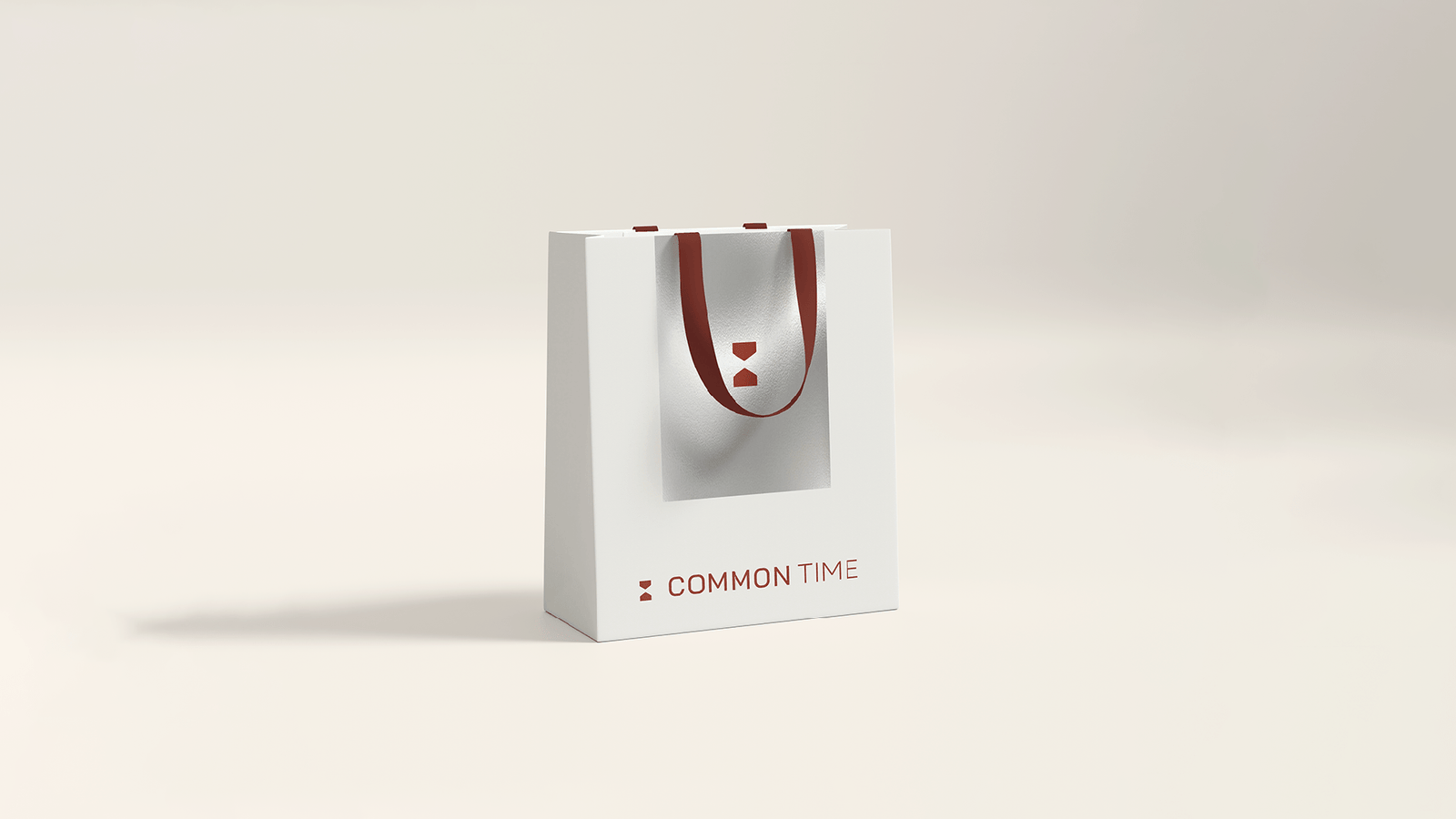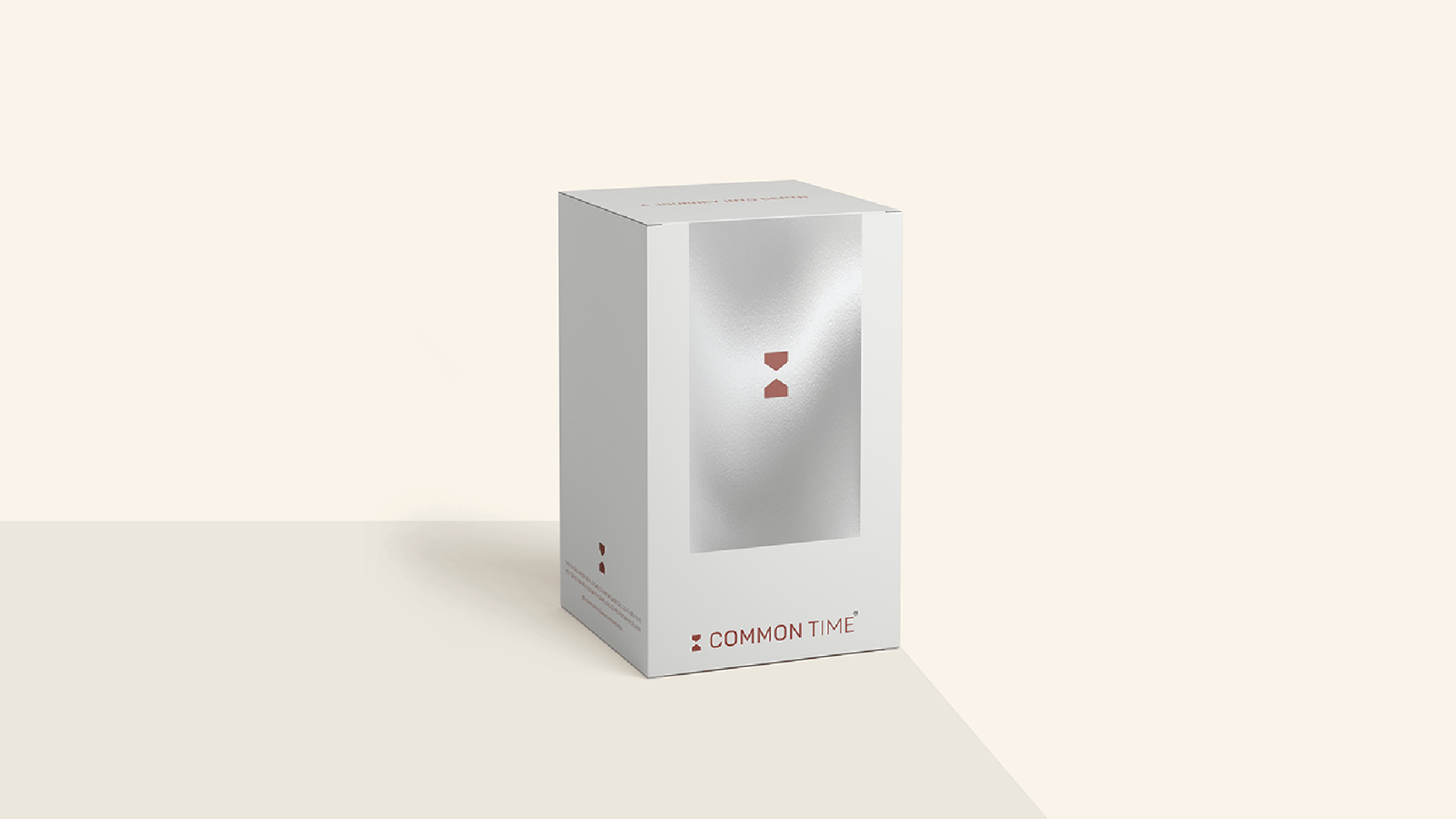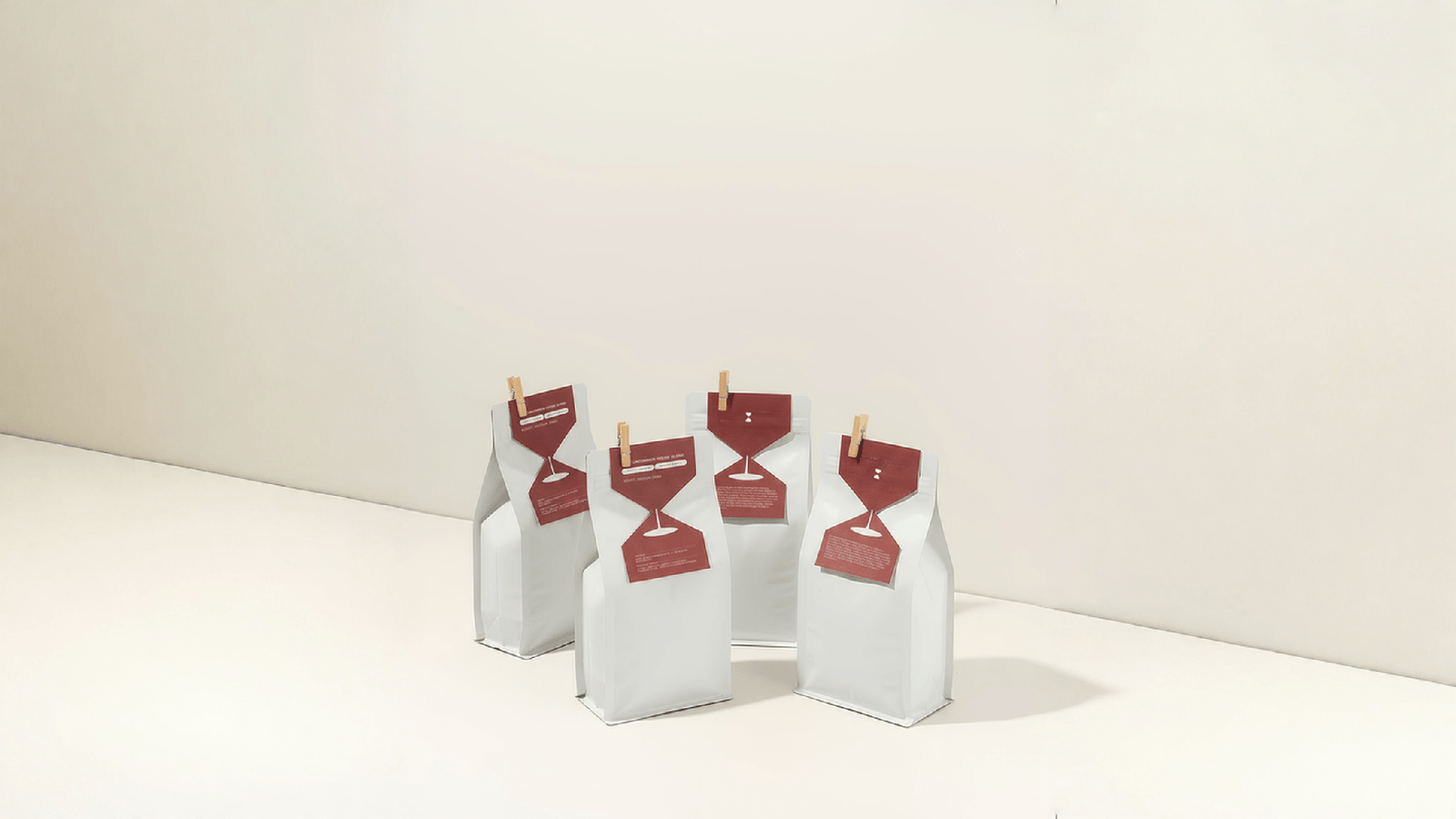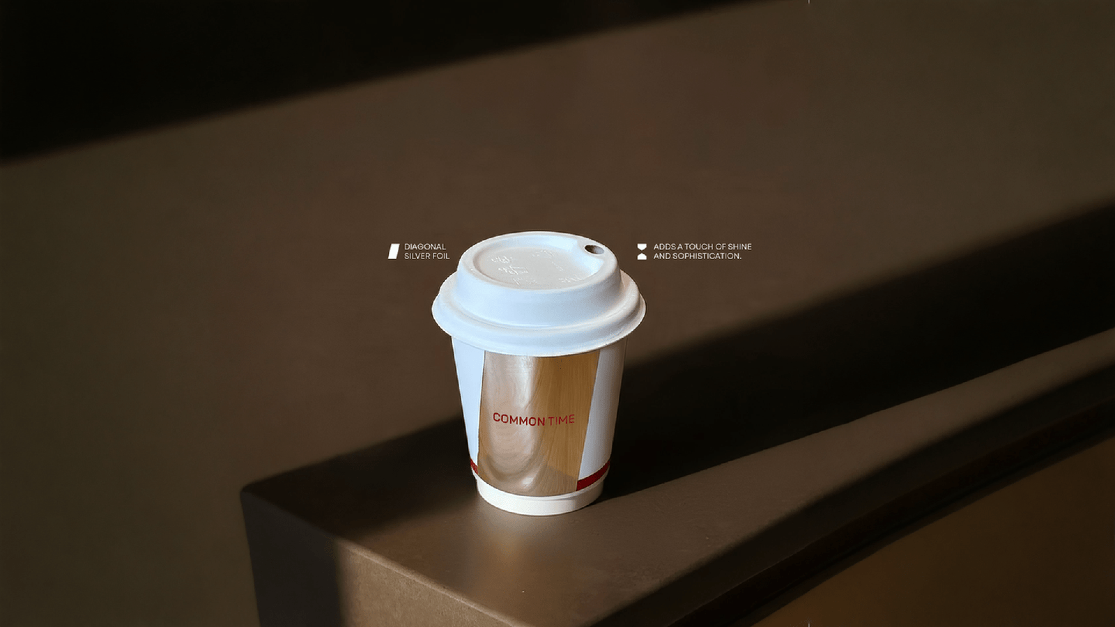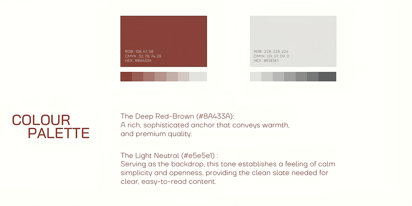


The packaging for Common Time is designed as an extension of the pause itself. Quiet, restrained, and thoughtful, it avoids excess and visual noise allowing space for reflection before the product is even opened. Materials are chosen for their tactile honesty and longevity, encouraging a slower, more deliberate interaction. Subtle textures, muted tones, and soft finishes create a sense of calm, while minimal typography and generous white space reinforce clarity and ease.